Plotting Data#
ACISpy provides several classes for plotting various quantities. These plots can be modified and saved to disk, or used in an interactive session. To make plots appear in an interactive IPython session, do one of the following:
In an IPython console: start as
ipython --matplotlibIn an IPython Qt console or notebook: start the first cell with
%matplotlib inline
This documentation page is actually a runnable IPython notebook. A link to the raw notebook can be found at the bottom of the page.
For the example plots we’ll show, we’ll use this Dataset:
[1]:
import acispy
msids = ["1dpamzt", "1deamzt", "1dp28avo","aopcadmd"]
ds = acispy.EngArchiveData("2016:318", "2016:338", msids, stat='5min')
Creating Plots of Data vs. Time#
DatePlot#
The DatePlot object can be used to make a single-panel plot of one or more quantities versus the date and time.
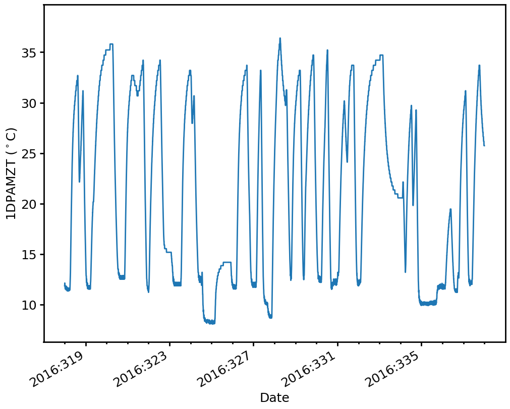
Plot of one MSID vs. time:
[2]:
dp1 = acispy.DatePlot(ds, "1dpamzt")
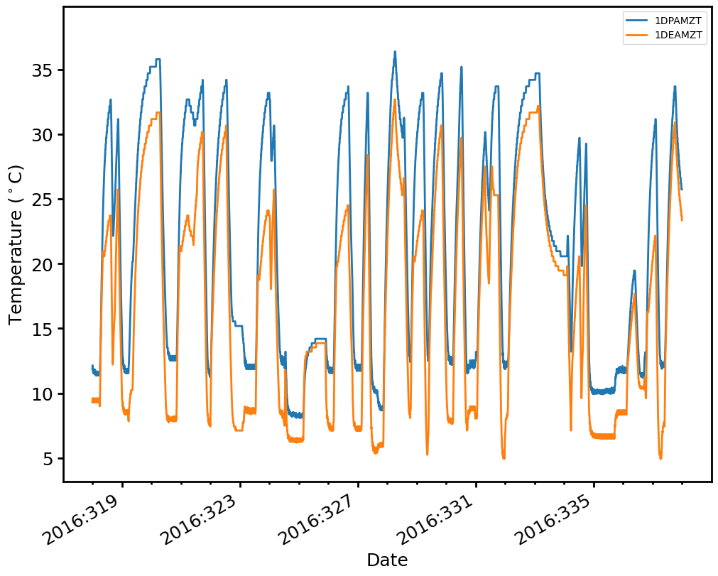
Plot of two MSIDs together vs. time:
[3]:
dp2 = acispy.DatePlot(ds, ["1dpamzt", "1deamzt"])
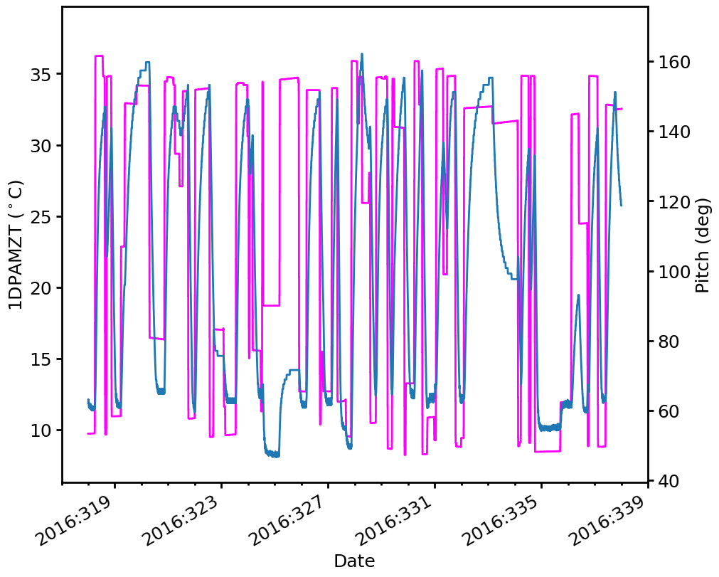
Plot of an MSID on the left y-axis and a state on the right y-axis:
[4]:
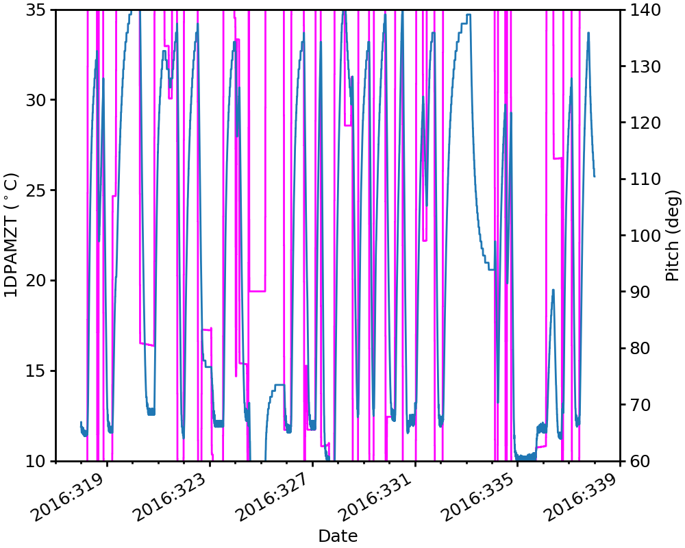
dp3 = acispy.DatePlot(ds, "1dpamzt", field2="pitch")
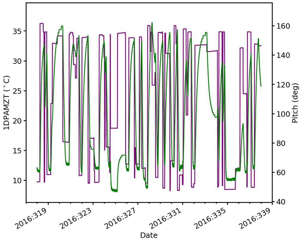
A number of options can be used to modify the DatePlot when creating it. For example, the width and color of the lines can be changed:
[5]:
dp4 = acispy.DatePlot(ds, "1dpamzt", field2="pitch", lw=2, color="green", color2="purple")
Some MSIDs do not correspond to particular numbers but have “state” values. These can be plotted as well:
[6]:
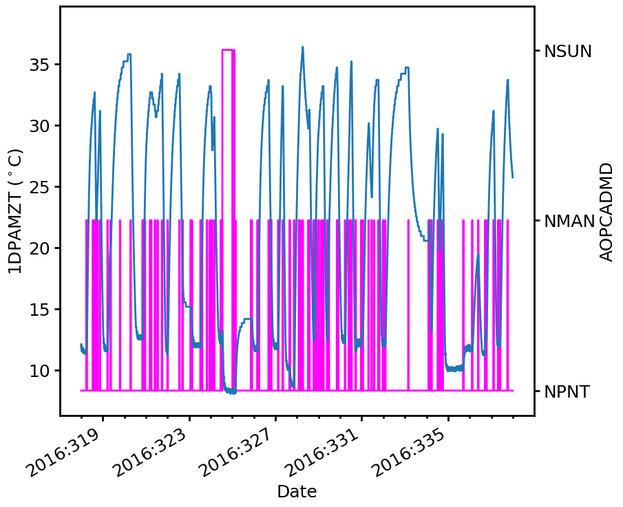
dp = acispy.DatePlot(ds, "1dpamzt", field2="aopcadmd")
dp.tight_layout()
/Users/jzuhone/Source/acispy/acispy/plots.py:182: UserWarning: The figure layout has changed to tight
  self.fig.tight_layout(*args, **kwargs)
CustomDatePlot#
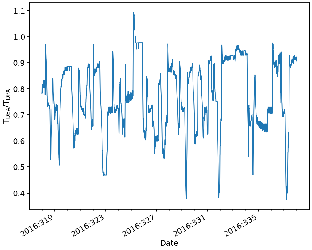
One may want to make a plot of data vs. time that isn’t restricted to the quantities in a Dataset. For this, ACISpy provides a CustomDatePlot class which can take an array of date/time strings and a corresponding array of quantities.
[7]:
# Ratio of 1DEAMZT to 1DPAMZT
times = ds.dates("1deamzt")
tratio = ds["1deamzt"]/ds["1dpamzt"]
dp5 = acispy.CustomDatePlot(times, tratio)
dp5.set_ylabel(r"$\mathrm{T_{DEA}/T_{DPA}}$")
Plot a DatePlot/CustomDatePlot with Another#
It’s also possible to use the Matplotlib Figure and Axes from an existing DatePlot/CustomDatePlot object for another one. Use the optional plot keyword argument and the plots will be shared:
[8]:
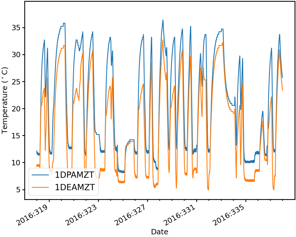
dp6 = acispy.DatePlot(ds, "1deamzt")
dp7 = acispy.CustomDatePlot(times, ds["1dpamzt"], plot=dp6)
dp7.set_ylabel("DPA and DEA")
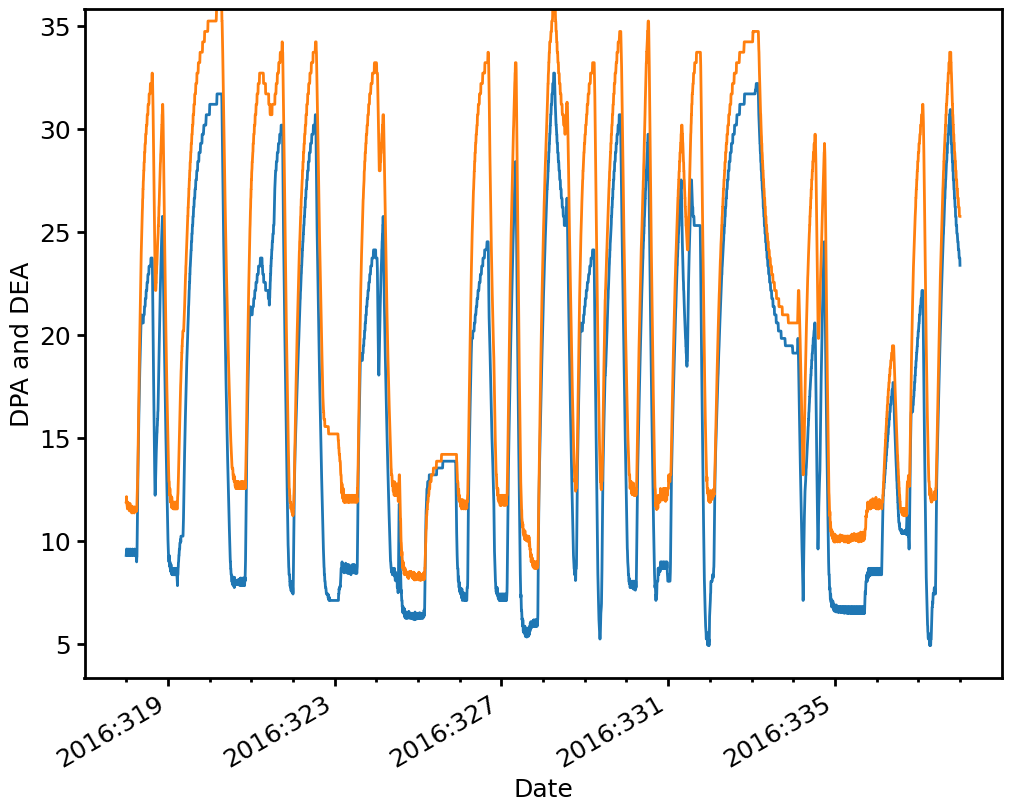
Operations which are performed on either DatePlot/CustomDatePlot object will automatically apply.
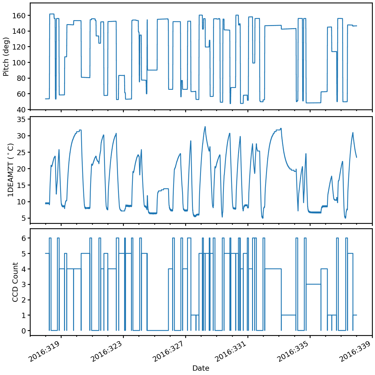
Creating Multi-Panel Plots#
The MultiDatePlot object can be used to make a multiple-panel plot of multiple quantities versus the date and time.
By default the panels are stacked vertically:
[9]:
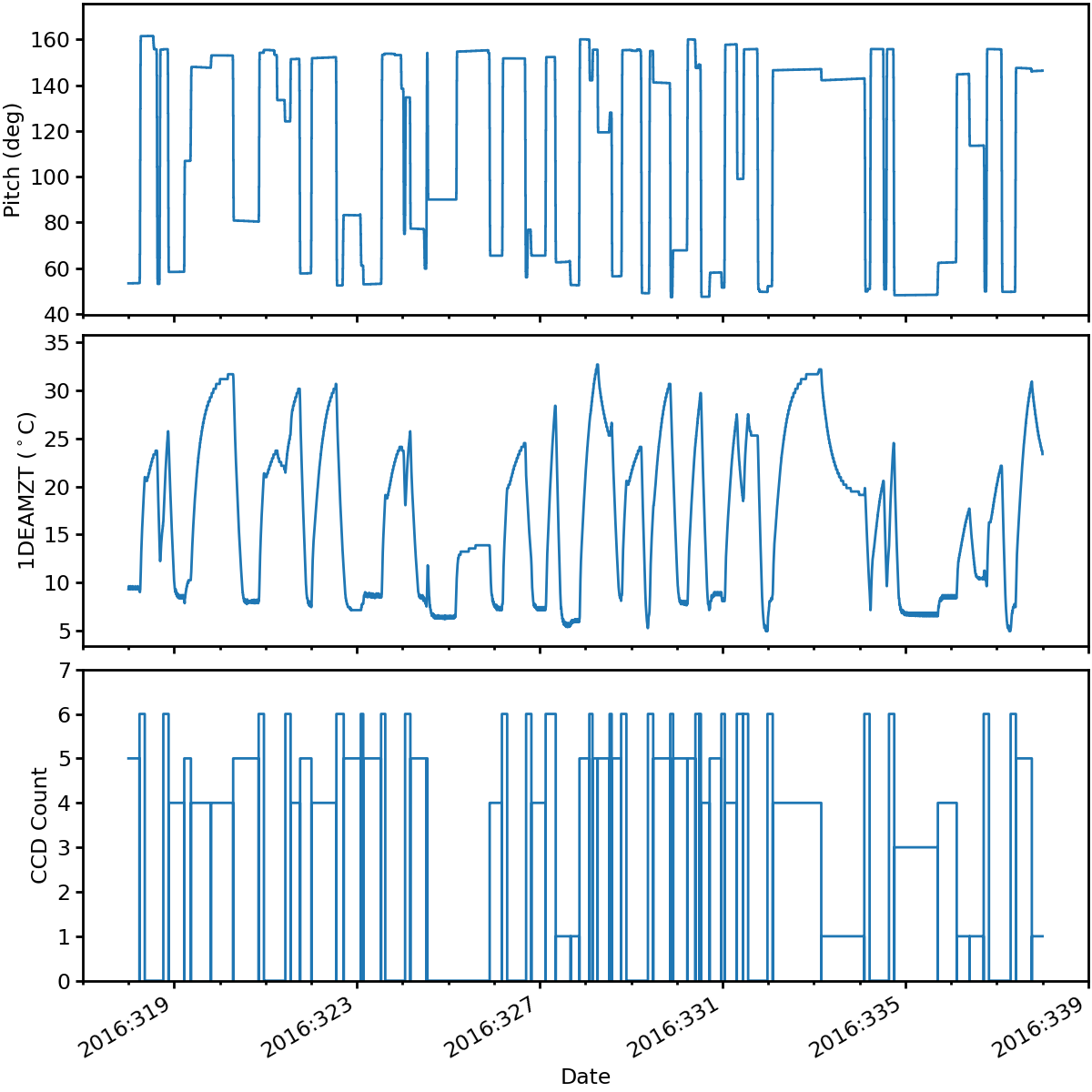
mdp1 = acispy.MultiDatePlot(ds, ["pitch", "1deamzt", "ccd_count"], lw=2, fontsize=17)
But by using the subplots keyword argument, the panels can be arranged in a (n_plot_x, n_plot_y) fashion:
[10]:
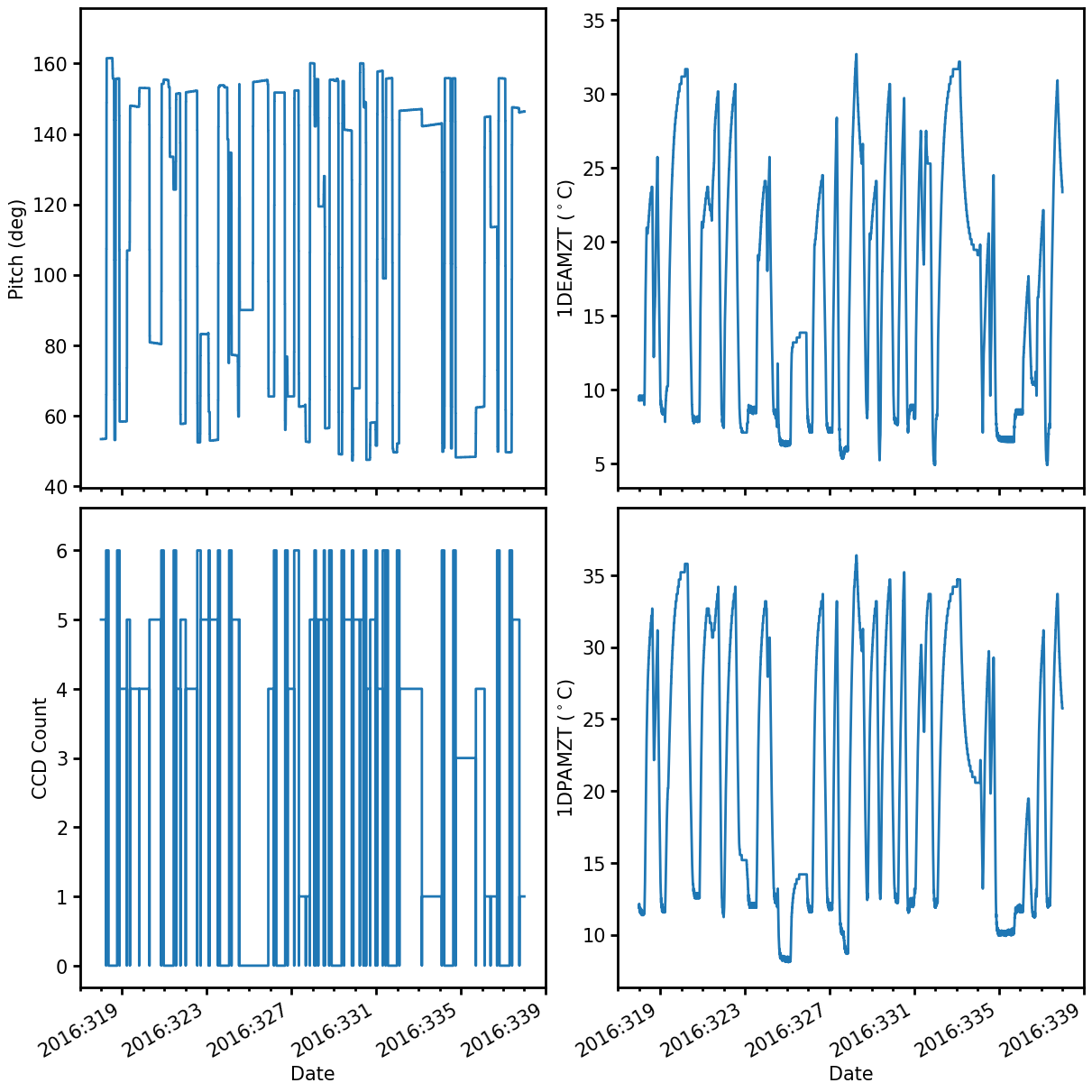
panels = ["pitch", "1deamzt", "ccd_count", "1dpamzt"]
mdp2 = acispy.MultiDatePlot(ds, panels, subplots=(2,2))
By nesting lists, it’s also possible to make subplots which have more than one quantity in a panel:
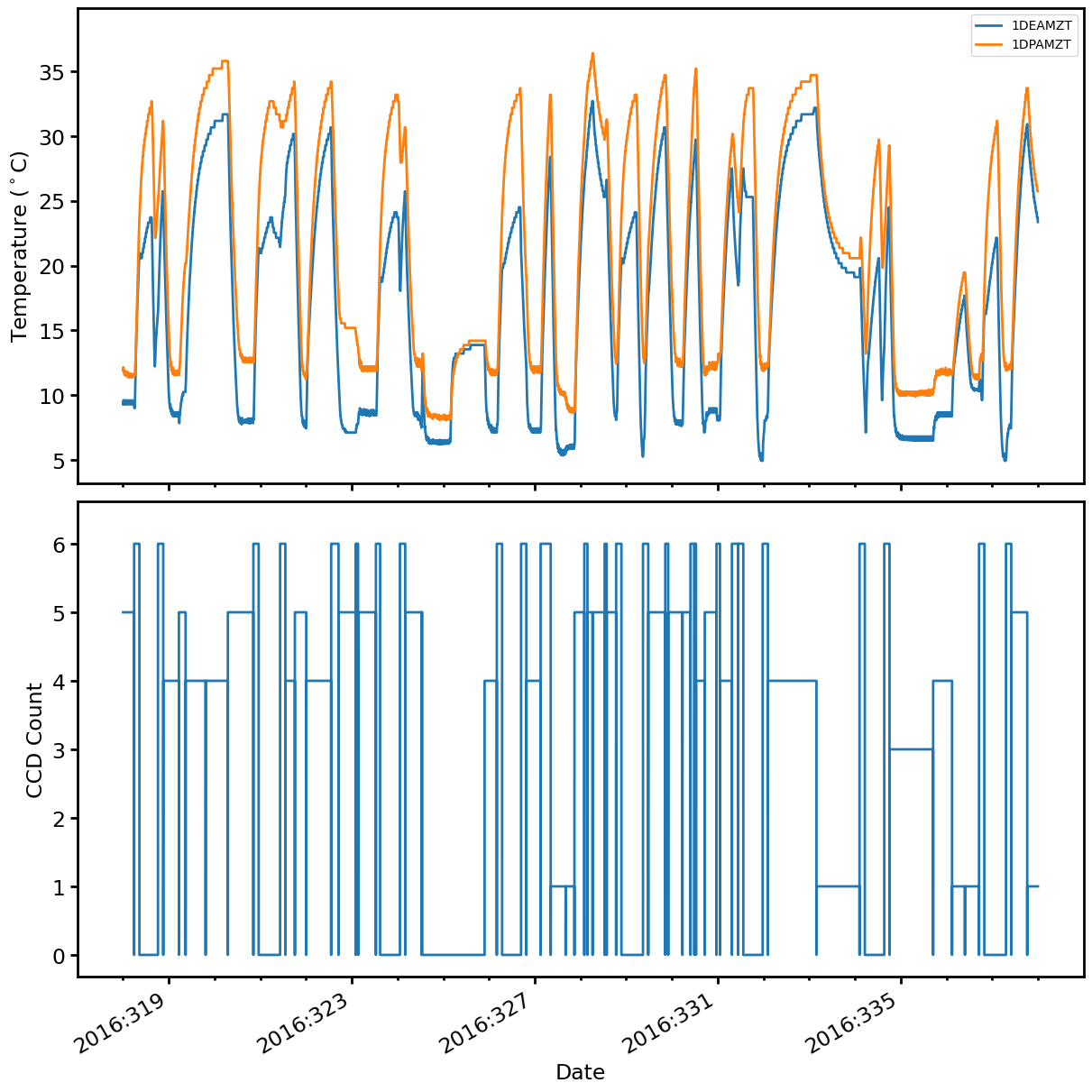
[11]:
# Note the first item in the list is another list
fields = [["1deamzt", "1dpamzt"], "ccd_count"]
[12]:
mdp3 = acispy.MultiDatePlot(ds, fields, lw=2, fontsize=17)
You can access each individual DatePlot panel in the MultiDatePlot in key-like fashion. For panels with more than one field plotted, the key for that panel is the specification for the first field:
[13]:
print(mdp1["ccd_count"])
print(mdp3["1deamzt"]) # This one has "1dpamzt" also
<acispy.plots.DatePlot object at 0x32e655d60>
<acispy.plots.DatePlot object at 0x33025bc80>
The above is not very useful by itself, but will come in handy later when we want to make modifications to individual panels, as we’ll show below.
Creating Histogram Plots#
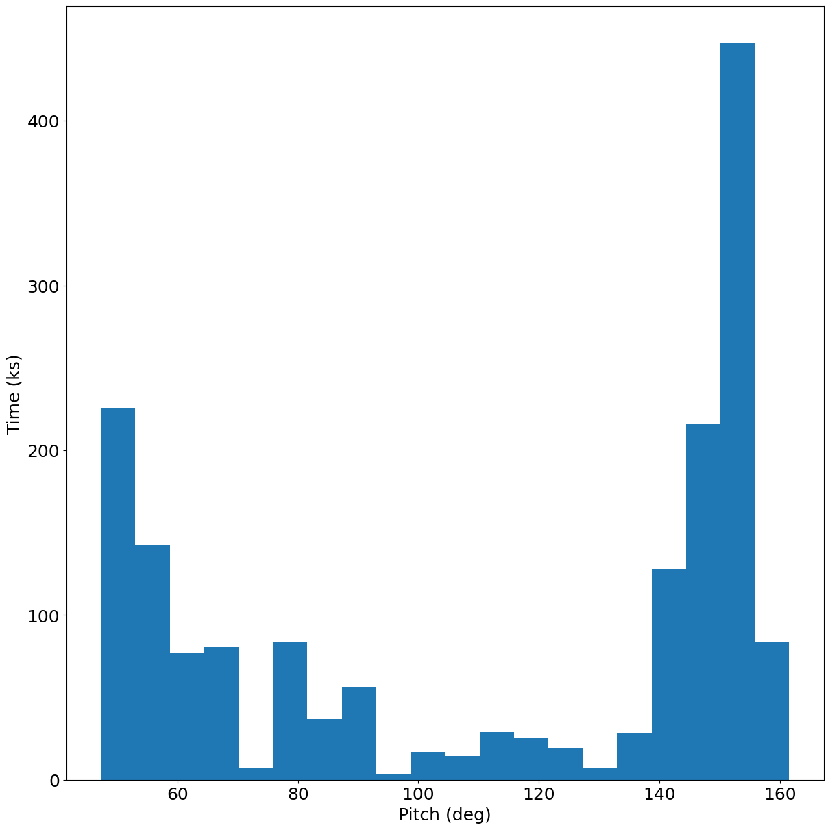
A HistogramPlot takes a state, MSID, or other data and produces a 1D histogram from it, which is weighted by time in kiloseconds:
[14]:
hp = acispy.HistogramPlot(ds, "pitch", bins=20)
Creating Phase Plots#
A PhasePlot shows one quantity plotted versus another. This can behelpful when trying to determine the behavior of one MSID versus another, or the dependence of an MSID on a particular commanded state.
There is an important caveat about PhasePlots: it is required that the data are interpolated to a common set of times. This requires that you have set stat="5min" in the EngArchiveData call (the default), or that you have mapped a state to a MSID.
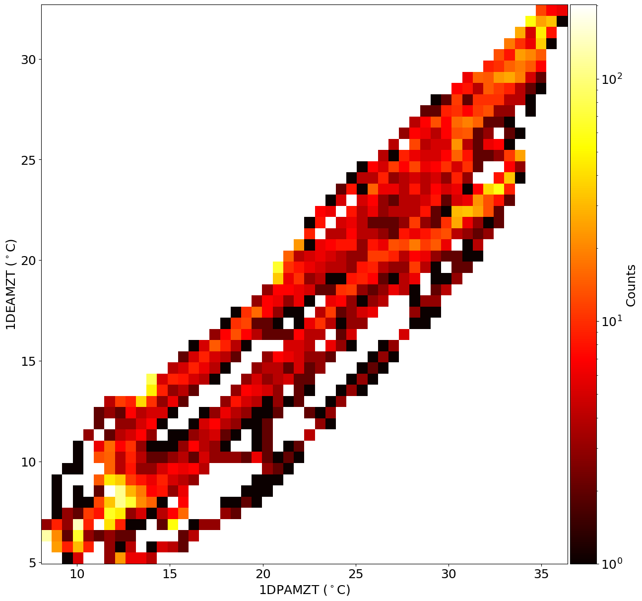
There are two kinds of PhasePlots in ACISpy: a PhaseScatterPlot and a PhaseHistogramPlot, which both plot one quantity vs. another but the former shows them as scattered points and the latter bins them up into a 2D histogram.
A histogram plot of one MSID vs. another:
[15]:
xbins = 50 # These can be integers or arrays specifying the bin edges
ybins = 50 # These can be integers or arrays specifying the bin edges
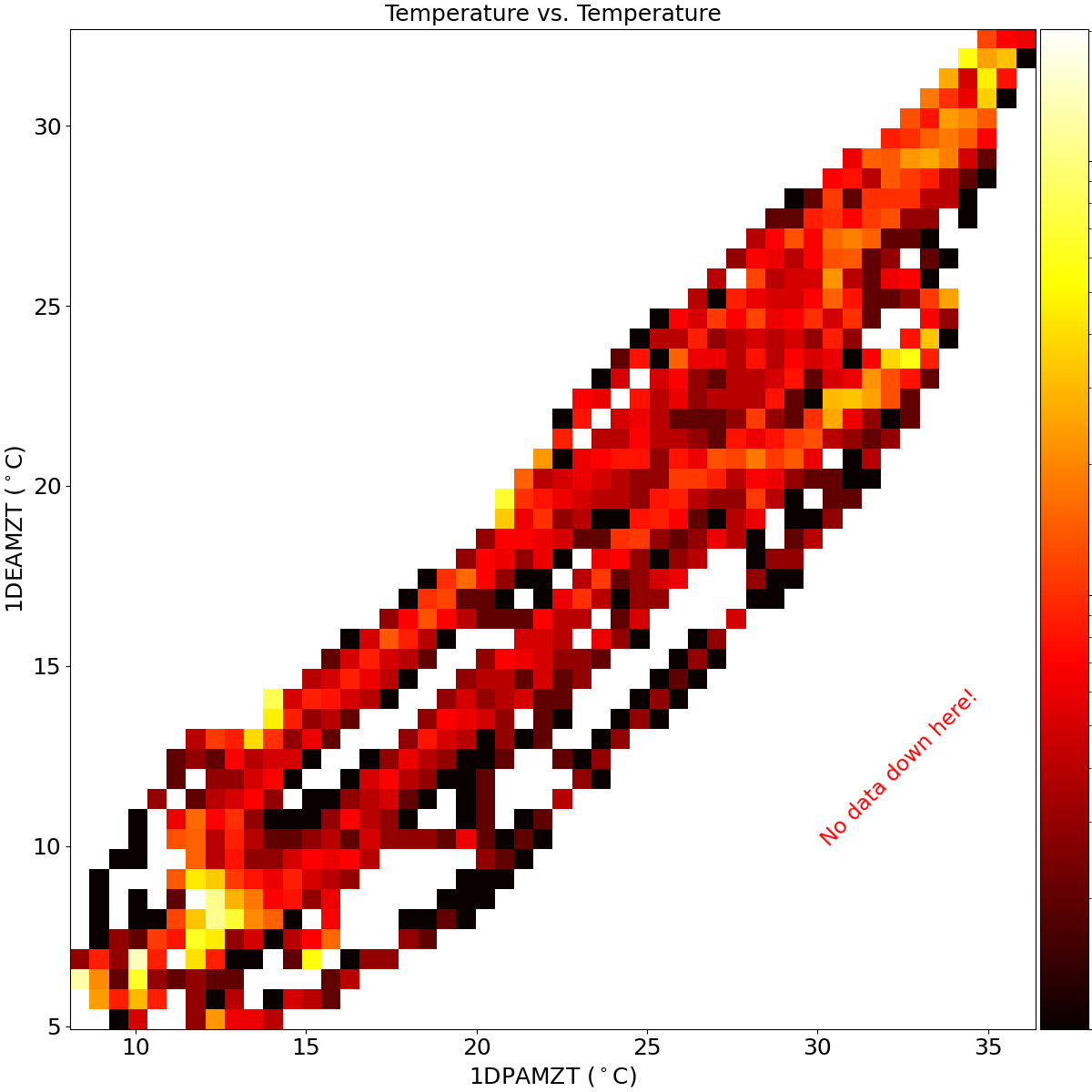
pp1 = acispy.PhaseHistogramPlot(ds, "1dpamzt", "1deamzt", xbins, ybins, scale='log')
A scatter plot of a MSID vs. a state:
[16]:
# Must map the state to the MSID times we want to map them to
ds.map_state_to_msid("pitch", "1deamzt")
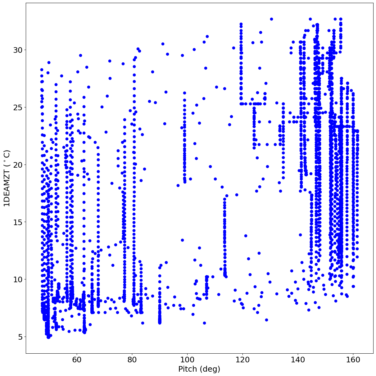
pp2 = acispy.PhaseScatterPlot(ds, ("msids", "pitch"), "1deamzt")
/Users/jzuhone/Source/acispy/acispy/plots.py:1313: UserWarning: No data for colormapping provided via 'c'. Parameters 'cmap' will be ignored
  pp = self.ax.scatter(np.array(self.xx), np.array(self.yy),
A plot of one state vs. another (no interpolation required in this case):
[17]:
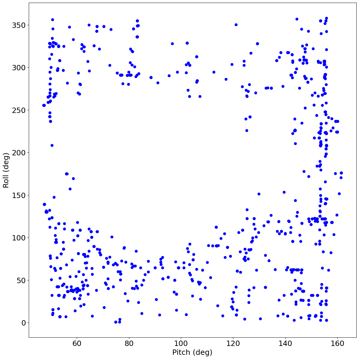
pp3 = acispy.PhaseScatterPlot(ds, ("states", "pitch"), "roll")
PhaseScatterPlots can also have their data points colored by a third quantity. To do this, we simply specify a third field in the argument c_field. Like the other fields, it must be interpolated to the same set of times. The cmap argument can change the colormap.
[18]:
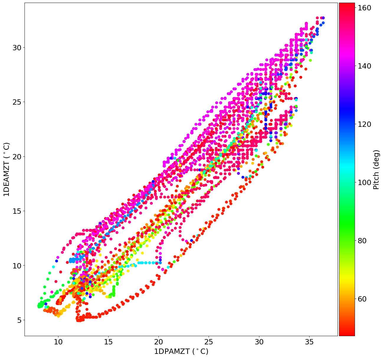
pp4 = acispy.PhaseScatterPlot(ds, "1dpamzt", "1deamzt", c_field=('msids', 'pitch'), cmap='hsv')
Plot Modifications#
The various plotting classes have methods to modify the plots after creating them. These include methods to control the limits of the plots, change plot labels, add titles, text, legends, lines, and grids, and save plots to disk.
Changing Plot Limits#
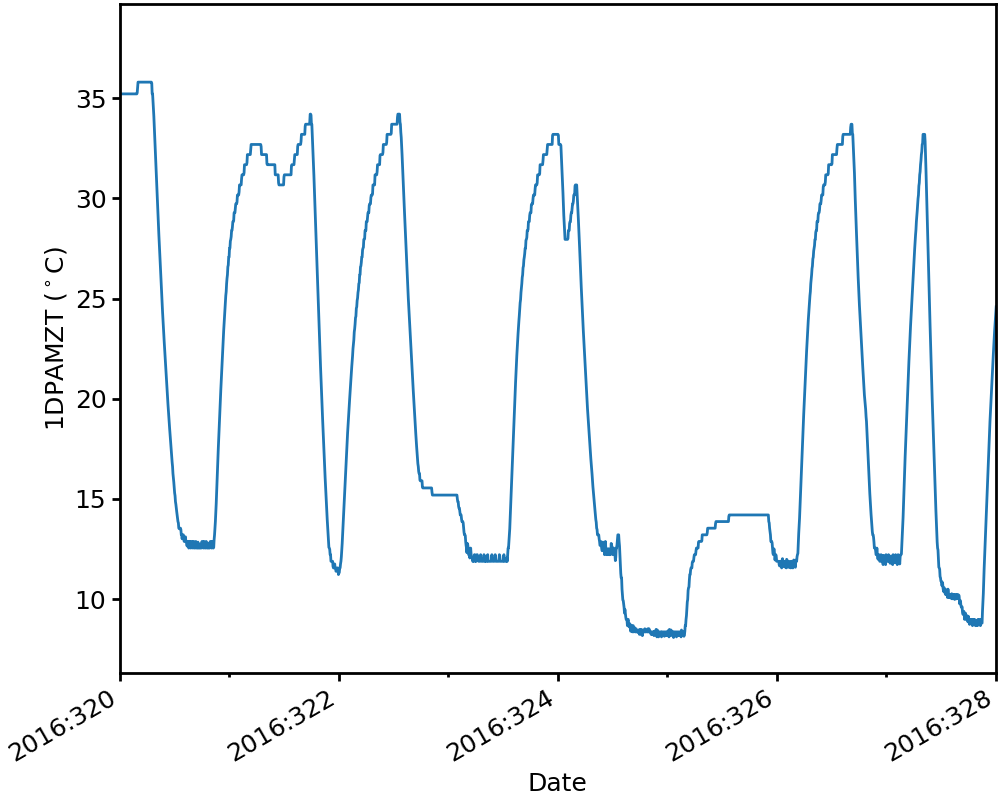
For DatePlot and MultiDatePlot, the date/time limits on the x-axis can be set using DatePlot.set_xlim. For example, the single plot of 1DPAMZT above can be rescaled:
[19]:
dp1.set_xlim("2016:320", "2016:328")
dp1
[19]:
For DatePlot objects, set_ylim() and set_ylim2() can be used to control the limits of the left and right y-axes of the plot, respectively:
[20]:
dp3.set_ylim(10, 35)
dp3.set_ylim2(60, 140)
dp3
[20]:
Since the individual panels of each MultiDatePlot are DatePlot instances, these methods work on the individual panels as well (note here the limits of the bottom panel change):
[21]:
mdp1["ccd_count"].set_ylim(0, 7)
mdp1
[21]:
Changing Plot Labels#
set_ylabel() and set_ylabel2() can be used to control the labels of the left and right y-axes of a DatePlot, respectively:
[22]:
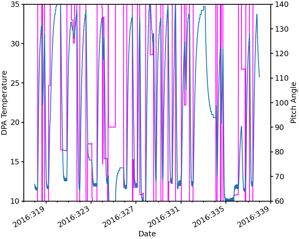
dp3.set_ylabel("DPA Temperature")
dp3.set_ylabel2("Pitch Angle")
dp3
[22]:
PhaseScatterPlot and PhaseHistogramPlot have similar methods for setting the labels on the x and y-axes, set_xlabel() and set_ylabel():
Adding Vertical and Horizontal Lines to a Plot#
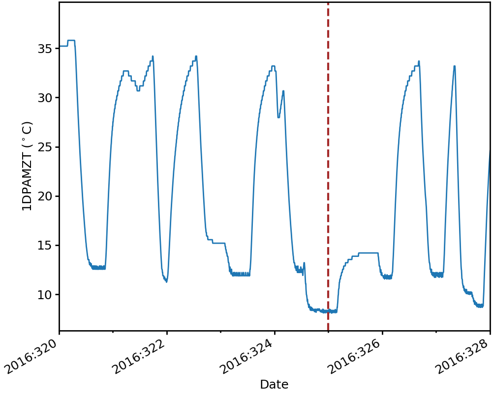
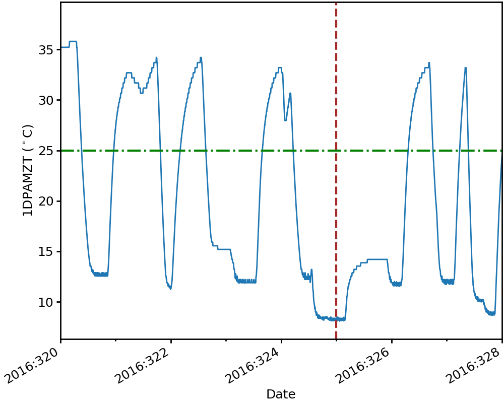
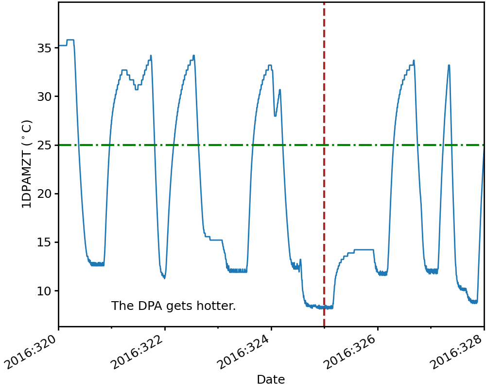
Vertical and horizontal lines may be added to any of the plot types using the add_hline() and add_vline() methods. The appearance of the lines can be controlled. For example, we’ll add a vertical dashed brown line on plot dp1 at midnight on day 16 of the year 2015, with a line width of 3.
[23]:
dp1.add_vline("2016:325:00:00:00.000", lw=3, ls='dashed', color='brown')
dp1
[23]:
Next, we’ll add a green horizontal dash-dot line at 25\(^\circ\)C:
[24]:
dp1.add_hline(25, lw=3, ls='dashdot', color='green')
dp1
[24]:
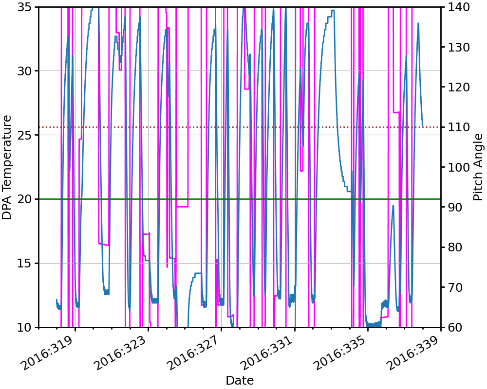
For a DatePlot with both left and right y-axes, horizonal lines can be added for both scales (use add_hline2() for the right y-axis):
[25]:
dp3.add_hline(20, lw=2, ls='solid', color='green')
dp3.add_hline2(110, lw=2, ls='dotted', color='brown')
dp3
[25]:

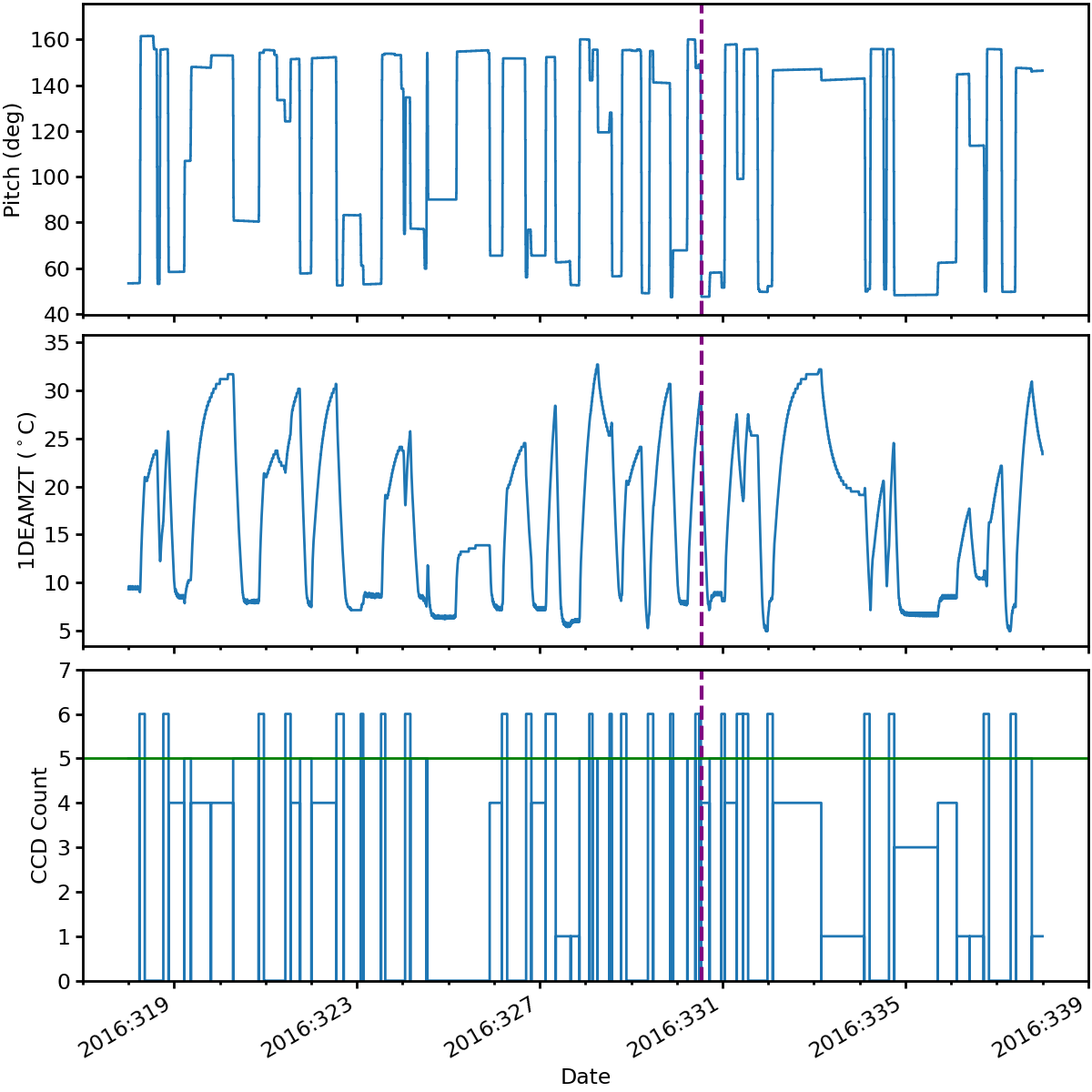
Adding a vertical line to a MultiDatePlot adds it to all panels, whereas to add a horizontal line to a panel you must add it to the individual plot:
[26]:
mdp1.add_vline("2016:330:12:45:56.031", color='purple', lw=3, ls='dashed')
mdp1["ccd_count"].add_hline(5, color='green', lw=2)
mdp1
[26]:
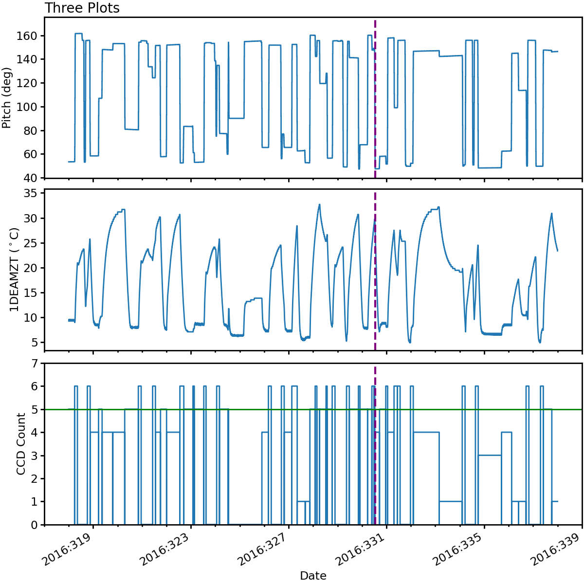
Adding a Title to a Plot#
The set_title() method for any of the plot types can be used to add a title to the top of the plot:
[27]:
mdp1.set_title("Three Plots", fontsize=20, loc='left') # "loc" sets the horizontal location of the title
mdp1
[27]:
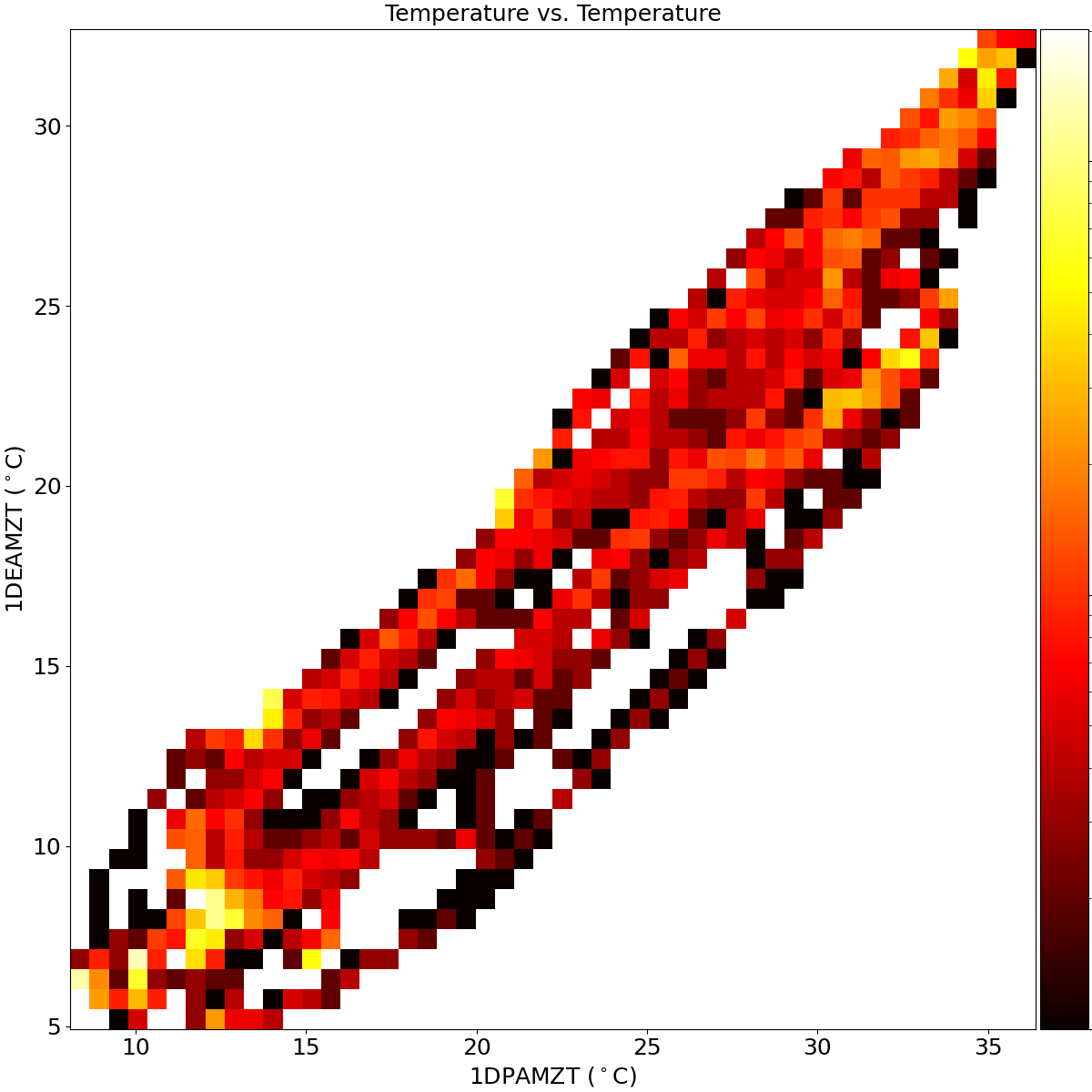
[28]:
pp1.set_title("Temperature vs. Temperature", fontsize=18)
pp1
[28]:
Annotating Obsids on a DatePlot#
The annotate_obsids() method allows one to annotate obsids on a plot, like so:
[29]:
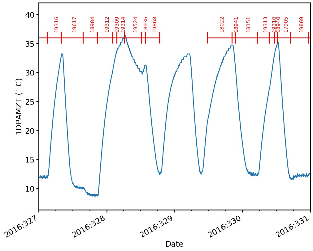
dp_obsids = acispy.DatePlot(ds, "1dpamzt")
dp_obsids.set_xlim("2016:327", "2016:331")
dp_obsids.annotate_obsids(36.0, fontsize=12)
dp_obsids.set_ylim(None, 42.0)
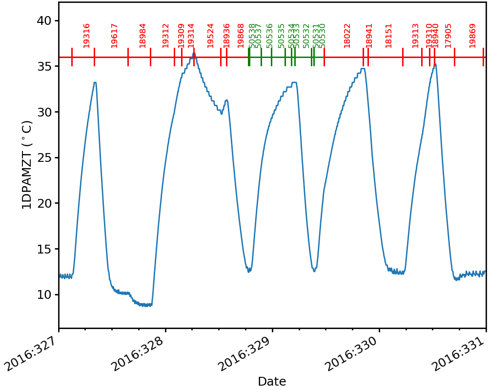
By default maneuver obsids are not plotted, but one can choose to show them:
[30]:
dp_obsids.annotate_obsids(36.0, fontsize=12, show_manuvrs=True, manuvr_color="g")
dp_obsids
[30]:
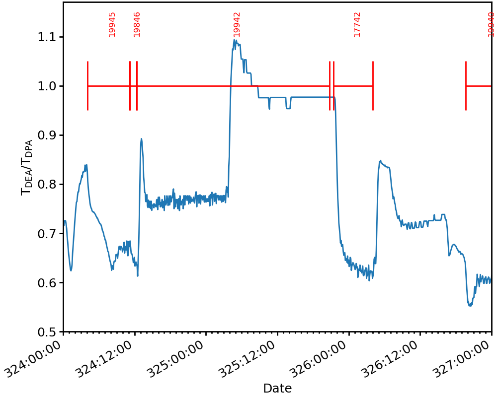
You can also use annotate_obsids() on a CustomDatePlot if you supply the dataset that was originally used to make that data that went into it. Note that here you may have to adjust some of the other properties of the annotations to get them to fit on the plot correctly:
[31]:
dp5.set_xlim("2016:324", "2016:327")
dp5.set_ylim(0.5, 1.17)
dp5.annotate_obsids(1.0, ds=ds, fontsize=12, ywidth=0.1, txtheight=0.1)
dp5
[31]:
Customizing a Legend on a DatePlot#
A DatePlot with multiple lines plotted on the left y-axis has a legend. This legend can be customized, by moving its location or changing the font size, using set_legend():
[32]:
dp2.set_legend(loc="lower left", fontsize=20) # loc sets location
dp2
[32]:
If you want to modify one of the labels in the legend, use the set_field_label() method:
[33]:
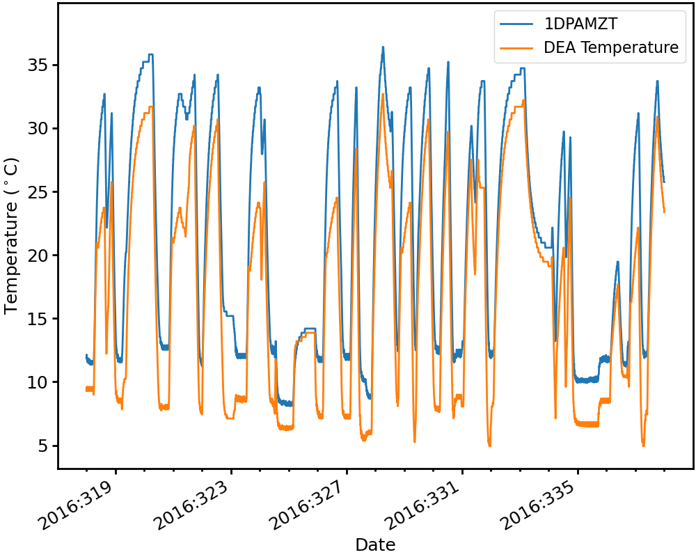
dp2.set_field_label("1deamzt", "DEA Temperature")
dp2
[33]:
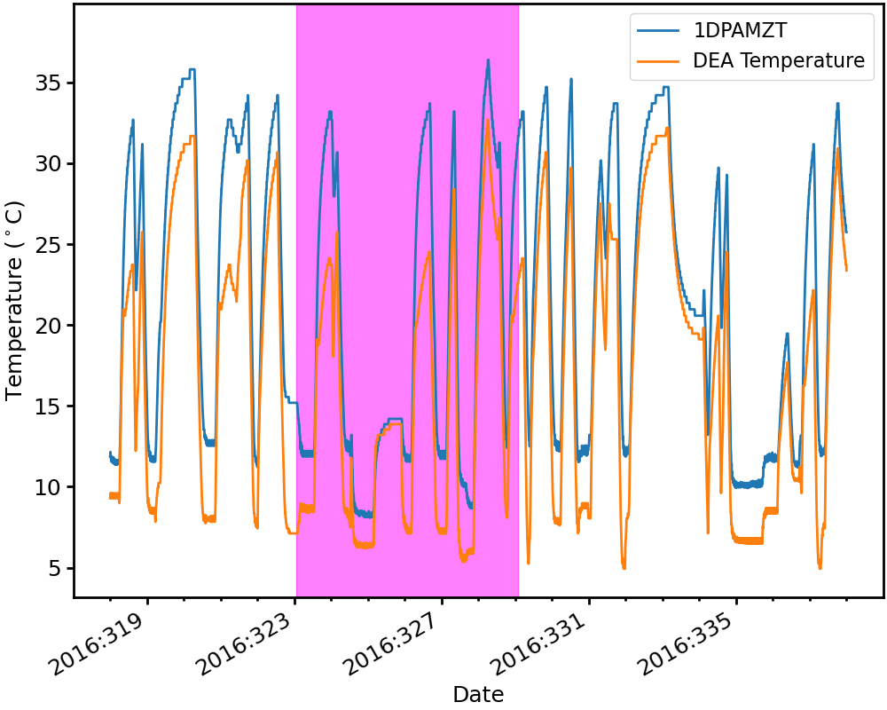
Filling Between Two Times on a DatePlot#
Use the fill_between() method to fill between two dates on a DatePlot with a particular color. You can set the transparency as well using the alpha keyword argument.
[34]:
start_fill = "2016:323:01:10:00"
end_fill = "2016:329:02:00:45"
color = "magenta"
dp2.fill_between(start_fill, end_fill, color, alpha=0.5)
dp2
[34]:
Adding Grid Lines to a Plot#
For any of the plot types, call the set_grid() to method to turn grid lines on and off on the plot:
[35]:
dp3.set_grid(True)
dp3
[35]:
Adding Text to Plots#
Text can be added to a DatePlot or PhasePlot by calling the add_text() method:
[36]:
dp1.add_text("2016:321:00:00:00", 8, "The DPA gets hotter.")
dp1
[36]:
[37]:
pp1.add_text(30, 10, "No data down here!", color='red', fontsize=17, rotation=45)
pp1
[37]:
Saving Plots to Disk#
Finally, for any of the plot types, call savefig() to save the figure:
[38]:
pp1.savefig("phase_plot.png")