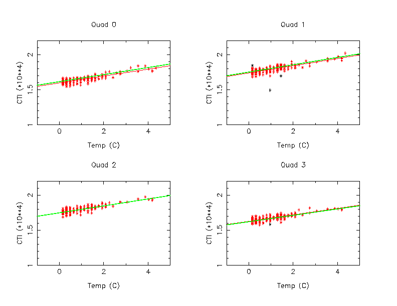
Figure 1: Temperature CTI Plots for CCD 6 Mn K alpha
Purpose of this memo is show what are the best selection of data without losing too many data points.
To make comparison simple, we selected data between DOM 500 and 1500. Time - CTI evolution between this time period seems quite linear. Although the periods of DOM 200-500, and after DOM 1500 also have their own linearities, there are discontinuities around DOM 500 and 1500.
The data used in this memo are CCD 6 Mn K-alpha data, but results are similar for the all other CCDs.
First, we examined temperature - cti relations. For this purpose, data with at least 2,000 sec integration time were used.
Figure 1 shows the results. The independent variable is the temperature in C and how much warmer than our base focal plane temperature -119.7 C, and the dependent variable is CTI. Black data points are more than 3 sigma away from the fitting line in the first round of fitting, and dropped from the analysis in the second round of the fitting.
Least square fit for two lines:
were tested on this data.
A red line is the fitting for the first, and the green line is for the second one. At least, for the temperature range of 4 degree (-119.7 C and -115.0 C), there is almost no difference between two lines. For the simplicity, the first relation was used for the rest of the analysis in this memo.
Using this fitting results, we corrected CTIs, and plotted according to integration time in Figure 2 (Quad 0 of CCD 6 Mn alpha only). The yellow points are the data with more than 7,000 sec integration time (in which most of them were observed with the focal temperature -119.7 C), and orange data points have the integration time between 1,000 and 2,000 sec (many of them have higher focal temperature). The top panel shows the plot without the temperature correction, and the bottom panel shows with the correction. Although all data are reasonably well corrected, the data with integration time less than 2,000 sec have much larger spreads before the correction, and hence the temperature correction does not correct them well.
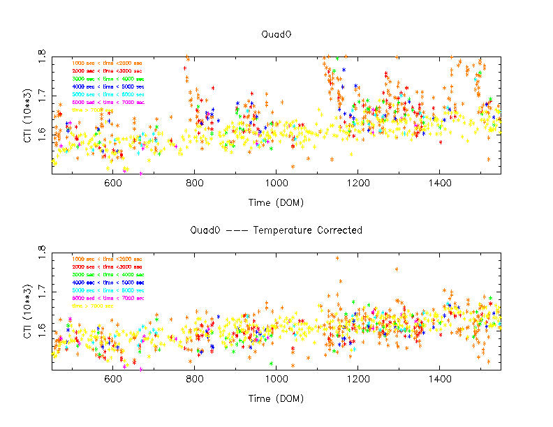
Figure 3 shows the same plot, but color coded with temperature, instead of the integration time. All data points with the integration time larger than 1,000 sec are included. As we can see, many low integration time data points in the Figure 2 correspond to the high temperature data points in Figure 3.
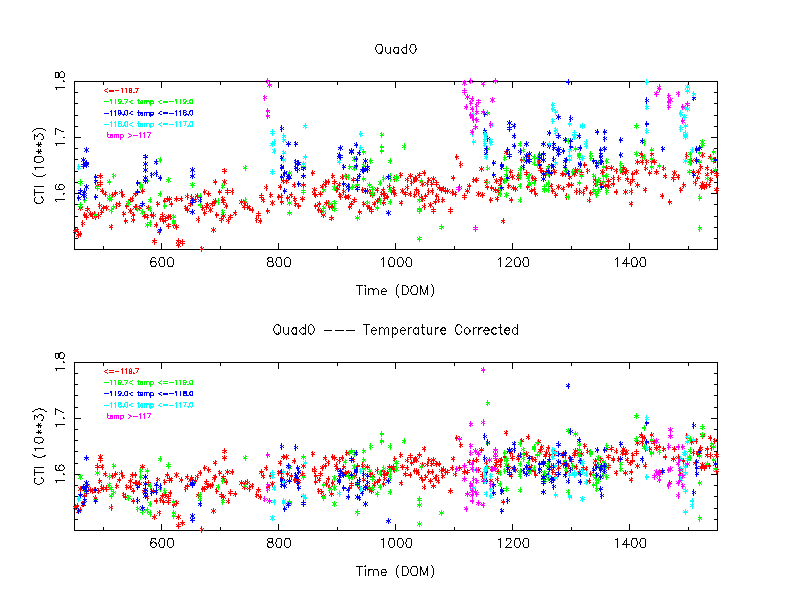
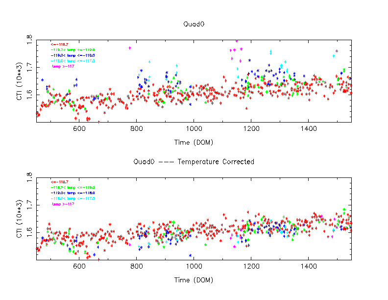
Figure 4 shows the same plot as Figure 4, but the integration time is now limited 2,000 sec or longer. The corrected data point plot is much tighter than that of Figure 3.
The next three figures show how this dispersion depend on integration time and temperature in a different format.
First, the linear relation was fitted on the data with the focal plane temperature with -119.7 C and the integration time 7,000 sec or longer. Then a predicted CTI for each data point was computed, and the difference between the prediction and the observed value was taken, and plotted (black data points in figures).
Second, using the linear relation obtained above, a similar procedure were taken for the data with the integration time between 2,000 and 3,000 sec. The results were shown in red.
Similarly, green ones in the figures are between 3,000 and 4,000 sec, indigo one s are between 4,000 and 5,000 sec, light blue ones are 5,000 and 6,000 sec, and magenta ones are 6,000 and 7,000 sec.
Figure 5 shows the focal temperature between -119.7 and -119.0 C, Figure 6 shows the focal temperature between -119.0 and -118.0 C, and Figure 7 shows the focal temperature between -118.0 and -117.0 C.
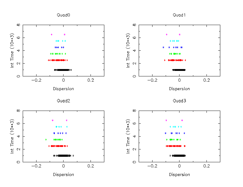
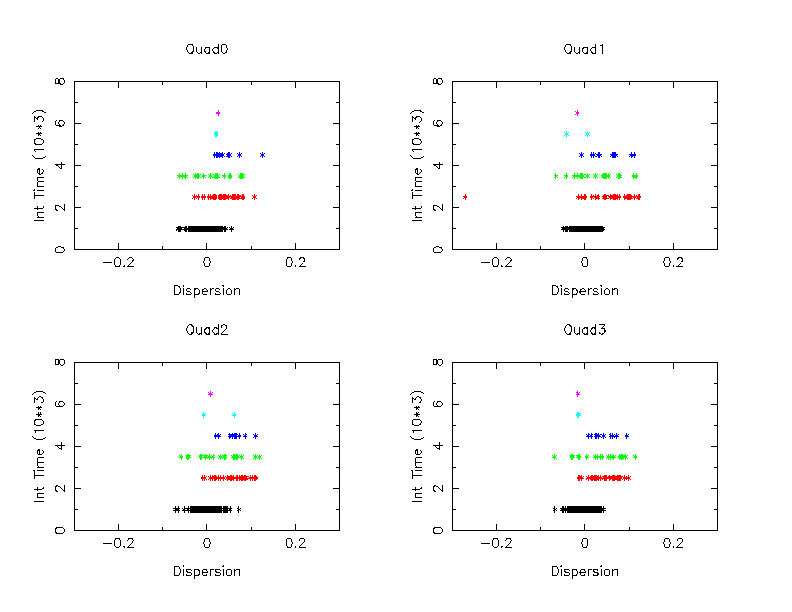
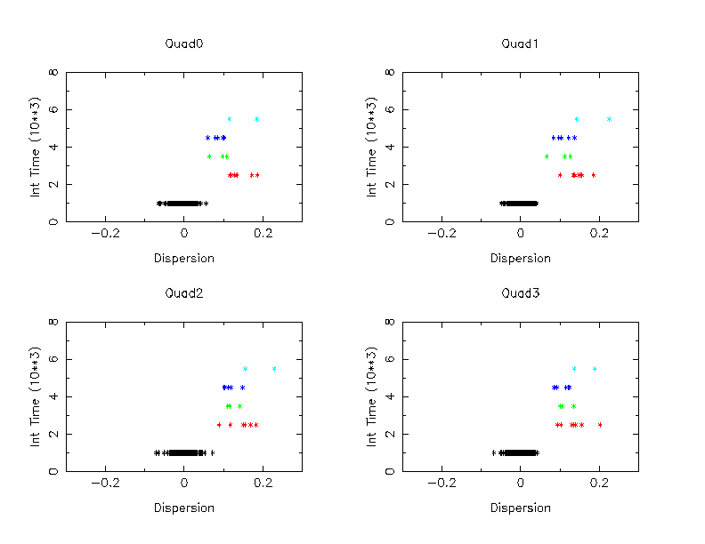
These figures show that as temperature increases, the data points are more under corrected. This is probably because the data are heavily concentrated toward colder end of the range.
As a conclusion, if we limit the data with the focal plane temperature colder than -118 C, and the integration time longer than 2,000 sec, the temperature dependency of the CTI seems reasonably well removed.